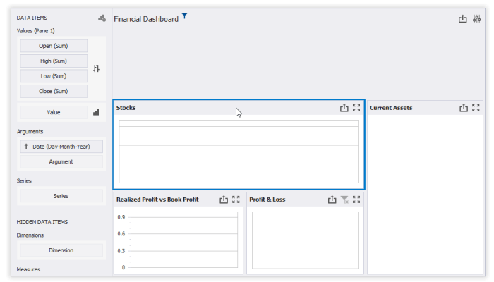
Visual BI dashboards are transforming how businesses interpret and utilize data, combining aesthetics with functionality to enhance decision-making processes. As organizations increasingly rely on data-driven strategies, the evolution of these dashboards has become critical in the realm of business intelligence. They serve not only as tools for data representation but also as platforms for actionable insights, demonstrating how the right visualizations can simplify complex datasets and empower users. Understanding the key components that define effective visual BI dashboards is essential for any organization looking to harness the power of data.
Introduction to Visual BI Dashboards
Visual BI dashboards are powerful tools used to represent data in a visually engaging manner, facilitating easier comprehension and analysis. Their primary purpose is to transform complex datasets into understandable visual formats, such as charts and graphs, which help stakeholders make informed decisions quickly. Over the years, the evolution of visual BI dashboards has been marked by advancements in technology and an increasing emphasis on data-driven decision-making within organizations, signifying their growing importance in the realm of business intelligence. An effective visual BI dashboard comprises several key components, including data visualization elements, user interactivity, and a clear layout that presents information intuitively.
Benefits of Using Visual BI Dashboards
Visual BI dashboards significantly enhance data comprehension and decision-making by presenting complex information in a simplified manner. These dashboards allow users across various industries to derive insights swiftly. For instance, retail businesses can monitor sales performance in real-time, while healthcare providers utilize dashboards to track patient data and operational efficiency. The inclusion of interactive elements, such as filters and drill-down capabilities, further boosts user engagement, allowing individuals to explore data tailored to their specific needs.
Design Principles for Effective Dashboards

Creating user-friendly visual BI dashboards involves adhering to best design practices that prioritize clarity and usability. Key guidance includes selecting appropriate color schemes that promote readability, organizing layout elements logically, and using typography that enhances legibility. Essential elements to include in a visual BI dashboard comprise:
- Clear and concise titles for each data visualization
- Consistent color palettes to avoid confusion
- Interactive options for user navigation
- Data labels that provide context without overwhelming users
- Responsive design to accommodate various devices and screen sizes
Tools and Technologies for Creating BI Dashboards

A variety of tools are available for creating visual BI dashboards, each offering unique features that cater to different organizational needs. Popular options include Tableau, Power BI, and Qlik, known for their user-friendly interfaces and robust data integration capabilities. When considering dashboard creation, organizations must weigh the benefits of cloud-based solutions against on-premises alternatives, as each presents distinct advantages in terms of accessibility, scalability, and security. Emerging technologies, such as AI integration and real-time data processing, are reshaping the dashboard development landscape, enabling businesses to gain deeper insights faster.
Data Visualization Techniques
Data visualization techniques play a pivotal role in the effectiveness of BI dashboards. Common techniques include bar charts, line graphs, and heat maps, each serving specific purposes depending on the data being represented. For example, bar charts are effective for comparing quantities across categories, while line graphs are ideal for displaying trends over time. Choosing the right visualization technique is crucial, as it aligns the data types with user needs, ensuring that insights are easily interpretable.
Implementing Visual BI Dashboards in Organizations
Successful implementation of visual BI dashboards within an organization requires a structured approach. Key steps include assessing business needs, selecting appropriate tools, and designing intuitive dashboards. Common challenges may arise during the implementation process, such as data quality concerns and user resistance. Strategies to overcome these challenges include establishing clear communication channels and providing comprehensive user training and support. Emphasizing user training ensures that stakeholders maximize the effectiveness of visual BI dashboards, leading to enhanced data utilization across the organization.
Future Trends in Visual BI Dashboards
The future of visual BI dashboards is poised for exciting developments, driven by advancements in data visualization and the impact of big data and machine learning. As organizations increasingly rely on data, dashboard functionalities will evolve to accommodate more complex analytics and predictive capabilities. Shifts in user expectations, such as the demand for real-time data and personalized experiences, will significantly shape future dashboard designs, pushing businesses to innovate continuously in their data representation strategies.
Final Thoughts

In conclusion, the journey through visual BI dashboards reveals their importance as essential tools for effective data management and decision-making. By embracing the benefits of well-designed dashboards, businesses can overcome challenges and adapt to the evolving landscape of data visualization. As future trends continue to shape these tools, organizations must stay informed and agile, ensuring they meet user expectations while leveraging innovative technologies to drive success.