Data visualization tools are essential in today’s data-driven world, transforming complex data sets into clear, accessible insights that drive informed decisions. As organizations grapple with ever-increasing volumes of information, these tools become crucial for interpreting data visually, enabling users to identify trends and patterns efficiently. The landscape of data visualization tools offers a variety of options, each designed with unique features that cater to different needs across industries.
With a plethora of tools available, it becomes imperative to understand their capabilities and the vital role they play in enhancing business intelligence. From Tableau to Google Data Studio, each tool brings its strengths and weaknesses, making it essential to choose the right solution that aligns with specific organizational goals.
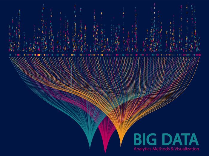
Overview of Data Visualization Tools
In today’s data-driven world, data visualization tools play a crucial role in helping individuals and organizations make sense of complex data. These tools transform raw data into visually appealing formats, enabling users to identify patterns, trends, and insights that would otherwise remain hidden in spreadsheets or databases. Effective data visualization aids decision-making, enhances communication, and promotes data literacy.
Various types of data visualization tools are available in the market, catering to different needs and skill levels. These include standalone software, web-based applications, and integrated solutions that work within larger business intelligence platforms. Key features of effective data visualization tools include user-friendly interfaces, a variety of visualization options (such as charts, graphs, and dashboards), real-time data processing capabilities, and the ability to easily share and collaborate on visualizations.
Popular Data Visualization Tools

The market is filled with numerous data visualization tools, each offering unique features that cater to different user requirements. Below is a list of some of the most popular tools:
- Tableau: Known for its powerful analytics and interactive dashboards, Tableau allows users to connect to multiple data sources and create highly customizable visualizations.
- Power BI: A Microsoft product, Power BI integrates seamlessly with other Microsoft services and provides robust data modeling and reporting features.
- Google Data Studio: This free tool is user-friendly and allows for collaborative reporting and visualization, making it ideal for small to medium-sized businesses.
The strengths and weaknesses of these tools vary greatly. Tableau offers in-depth analytics capabilities but can be costly. Power BI provides excellent integration with Microsoft tools but may have a steeper learning curve. Google Data Studio is accessible and easy to use, yet it may lack the advanced features found in other tools.
| Tool | Pricing Model | Key Features |
|---|---|---|
| Tableau | Subscription-based | Interactive dashboards, extensive data source integrations, advanced analytics |
| Power BI | Free and Pro versions | Seamless Microsoft integration, natural language queries, data modeling |
| Google Data Studio | Free | Collaboration features, easy sharing, integration with Google products |
Use Cases of Data Visualization Tools
Data visualization tools are widely adopted across various industries, enhancing the ability to interpret data effectively. Sectors such as healthcare, finance, and marketing benefit significantly from visualizing complex datasets. For instance, healthcare organizations leverage data visualization to track patient outcomes and operational efficiencies. Financial analysts utilize these tools to visualize market trends and investment opportunities, while marketers assess campaign performance through visual dashboards.
Organizations often employ data visualization to drive decision-making and improve reporting accuracy. A notable case study involves a retail company that implemented Tableau to analyze customer purchasing behaviors. By visualizing sales data, the company identified key trends that led to targeted marketing strategies and a subsequent increase in revenue by 20%.
Best Practices for Using Data Visualization Tools
Creating effective visualizations relies heavily on following best practices. When designing visual representations of data, it is essential to maintain clarity and focus. Best practices include selecting the right chart type for the data being presented, using color thoughtfully to highlight important elements, and ensuring that the visualization is not overly cluttered.
When selecting the suitable type of visualization for different datasets, consider the following tips:
- Use bar charts for comparing categories.
- Line graphs are ideal for showing trends over time.
- Pie charts can effectively convey parts of a whole, but should be used sparingly.
To avoid common pitfalls in data visualization design, it is crucial to:
- Avoid using too many colors or styles that may distract from the data.
- Ensure that all axes and labels are clearly defined and easy to read.
- Test the visualization with diverse audiences to ensure understanding.
Future Trends in Data Visualization

The future of data visualization is shaped by emerging trends and technologies. Artificial intelligence (AI) and machine learning (ML) are playing increasingly vital roles in enhancing visualization tools. These technologies can automate data processing, uncover insights, and suggest the best visualization methods based on the data characteristics.
As data complexity grows, the need for more intuitive and interactive visualization tools becomes evident. Virtual reality (VR) and augmented reality (AR) are also starting to carve out niches in data visualization, providing immersive experiences for users to engage with data dynamically.
Potential challenges, such as data privacy concerns and the need for robust cybersecurity measures, will arise as technology advances. However, these developments present significant opportunities for businesses to utilize data visualization tools more effectively, making data-driven decisions that lead to improved outcomes.
Learning and Resources
For those looking to deepen their understanding of data visualization tools, numerous resources are available. Online courses and tutorials can provide structured learning paths and hands-on experience. Platforms like Coursera and Udemy offer courses tailored to various skill levels, from beginners to advanced users.
Additionally, several books focus on data visualization principles and practices, including:
- “Storytelling with Data” by Cole Nussbaumer Knaflic
- “The Visual Display of Quantitative Information” by Edward R. Tufte
- “Data Visualization: A Practical Introduction” by Kieran Healy
Engaging with community forums and groups can also be beneficial. Users can share knowledge and experiences in spaces like:
- Reddit’s Data Is Beautiful
- Tableau Community Forums
- Power BI Community
Last Recap: Data Visualization Tools
In summary, data visualization tools not only simplify data interpretation but also empower organizations to make strategic decisions based on visual insights. As we look toward the future, the integration of advanced technologies like artificial intelligence will further elevate the potential of these tools, presenting new opportunities and challenges. Embracing best practices and staying informed about emerging trends will ensure that users maximize the benefits of data visualization, fostering a culture of data-driven decision making.